Get in touch
Want to know more?
Contact me to schedule a live demo with further details of my work and download my resume by clicking on the button below.
Download my ResumeMetlife Mexico, a leading insurance company, sought to streamline the quoting process for their sales representatives, specifically targeting teachers across the country.
The goal was to replace the traditional paper-based method with a mobile app for tablets, designed to work on Android devices. This innovative solution aimed to enable sales representatives to provide instant quotes by asking a series of questions, even in remote areas without reliable internet connectivity.
UX/UI Designer
Sep,2017 - Mar, 2018
Mexico City
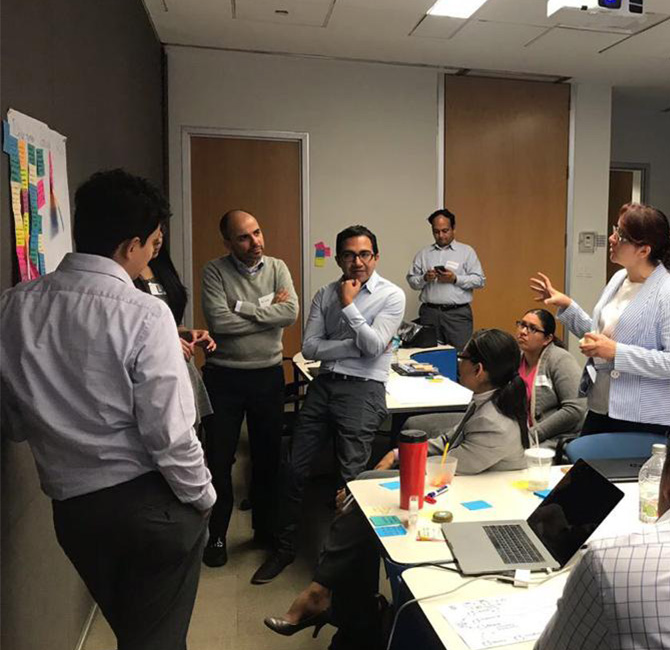
To gain deep insights into the workflow of Metlife's sales representatives, a comprehensive discovery process was undertaken. This involved shadowing the representatives as they performed their tasks, which mainly consisted of capturing potential client information on paper forms. In addition to direct observation, interviews were conducted to understand pain points, challenges, and opportunities for improvement.
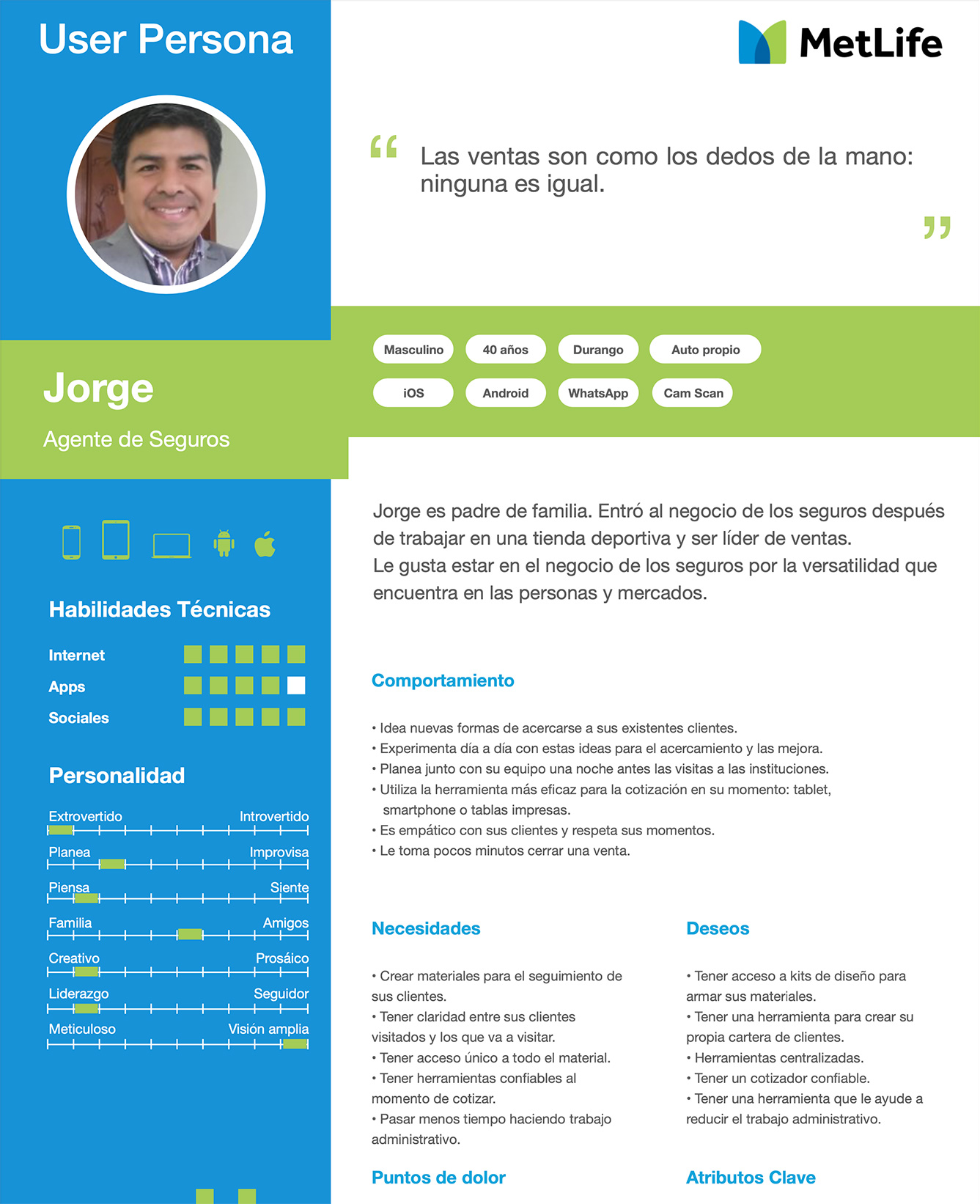
The main user personas on which the discovery was performed were the sales representatives. The diversity in age, gender, tech proficiency, and locations among the sales representatives emphasizes the need for a user-friendly app catering to various needs and contexts.
This approach ensures inclusivity and accessibility for all users across different levels of tech-savviness and geographical locations in Mexico.
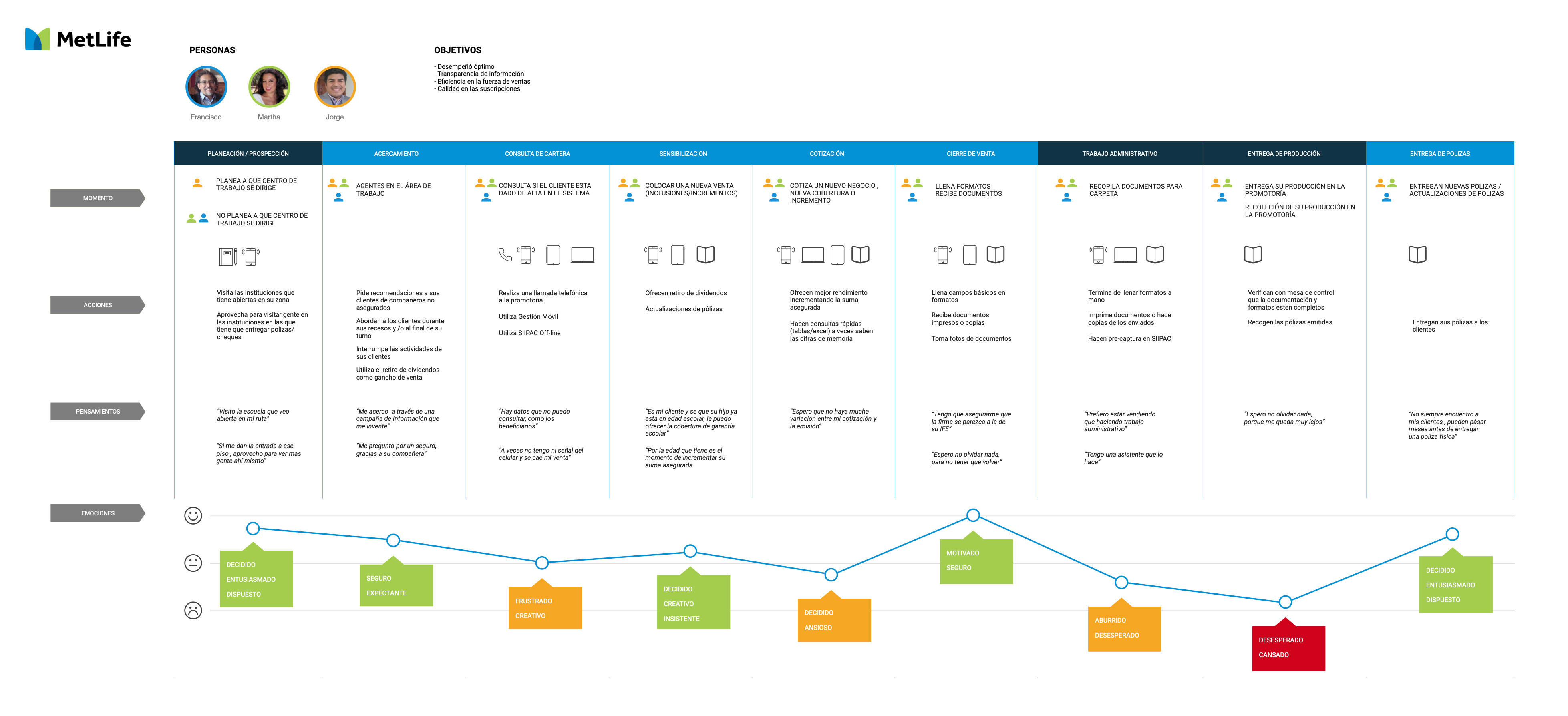
Mapped out the complete process of capturing client information, highlighting key touchpoints and pain points in the current workflow.
Developed detailed user flows to visualize the steps and decision points within the app. This focused on optimizing the workflow for efficiency.
Created low-fidelity wireframes to outline the app's structure and information hierarchy. Iterative feedback sessions were conducted to ensure alignment with user needs.
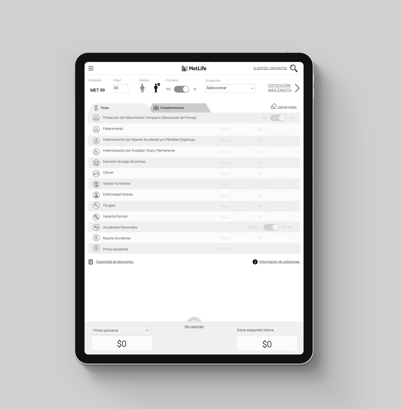
Prioritized designing for offline functionality, acknowledging the varied connectivity situations in different regions. Users could capture data without internet access and sync when connected.
Ensured the interface was clean, uncluttered, and easy to navigate. A simplified user experience was paramount for users with diverse tech skills.
Implemented real-time feedback mechanisms during data input to reduce errors and enhance the overall user experience.
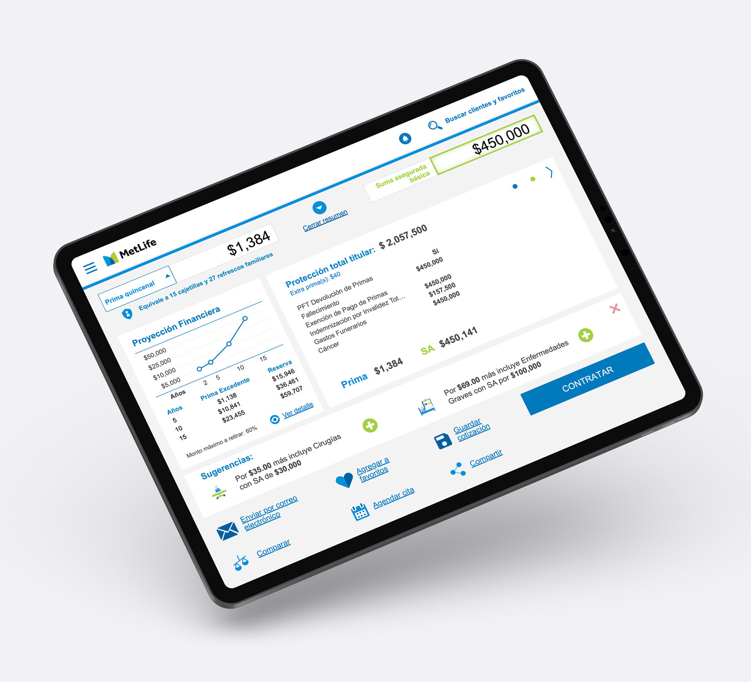
Low and high fidelity prototypes were developed to simulate the app's functionality. Usability testing sessions were conducted with a sample of sales representatives to gather feedback on navigation, interactions, and overall user experience.
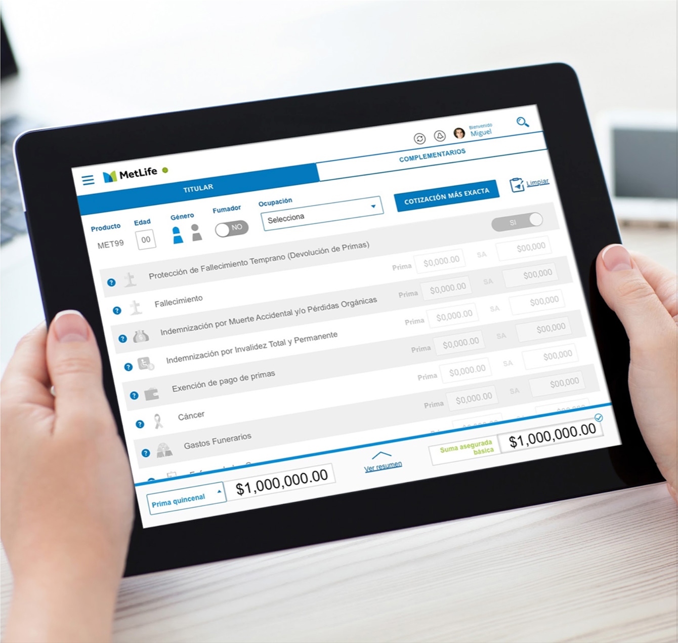
The Metlife Mexico Tablet App UX Discovery exemplifies the transformative impact of user-centered design even in the absence of code development. By closely aligning with user needs, this exercise laid the foundation for a potential future development phase. The UX discovery and design exercise successfully showcased the potential benefits.
The tablet app, if developed, would have significantly streamlined the quoting process, saving valuable time in digitalizing all the information and reducing reliance on paper forms. The emphasis on offline functionality proved crucial for accessibility in remote areas. This project stands as a testament to the value of thorough discovery and design exercises in shaping efficient and user-friendly digital solutions.
Contact me to schedule a live demo with further details of my work and download my resume by clicking on the button below.
Download my Resume